This section describes the common user interface elements used throughout the web application.
The Layout
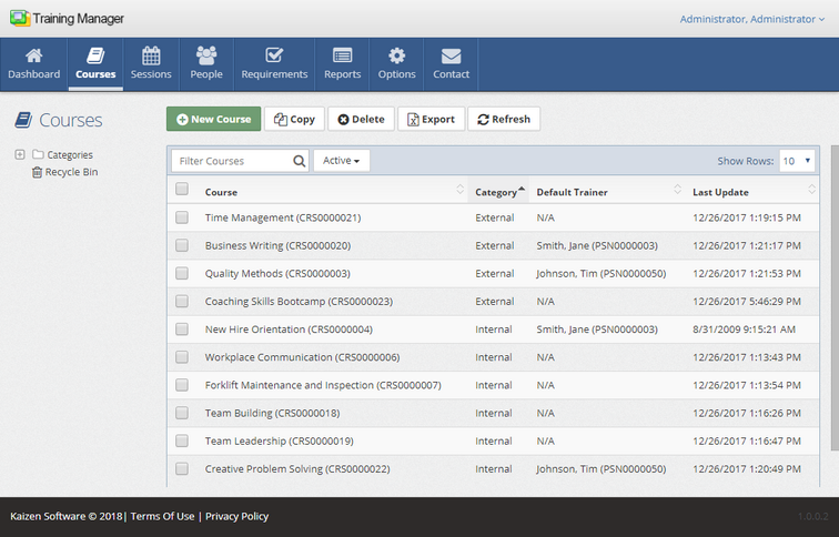
The Training Manager window is divided into 4 areas:
| 1. | Main Navigation Buttons along the top (Dashboard, Courses, Sessions, People, Requirements, Reports, Options, Contact) |
| 2. | The Toolbar Buttons below the main navigation. |
| 3. | The List or Detail View in the main/central area of the screen. |
| 4. | Navigation Folders on the left. |
The Main Navigation Buttons
The Main Navigation Buttons allow you to easily switch between the main pages in the web application: Dashboard, Courses, Sessions, People, Requirements, Reports, Options, Contact. The button for the current page is highlighted ("Courses" in the screenshot below).

The List/Detail Views
The main part of the list view pages will display a list of records. When you click on an item in the list, it will display the detail view for that item.
Search a list by typing your search criteria into the Filter box.
The Navigation Folders
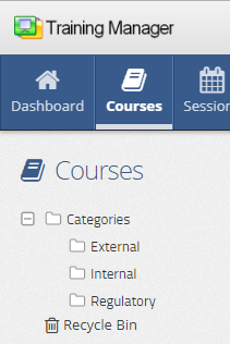
The list view pages contain navigation folders on the left side of the screen. These folders allow you to organize the data into groups and quickly filter the list by clicking on a folder. You may create new folders by right-clicking on the navigation folder area and selecting the "New" option from the menu. Or, rename an existing folder by right-clicking on the folder and selecting the "Rename" menu option.
Picture Fields
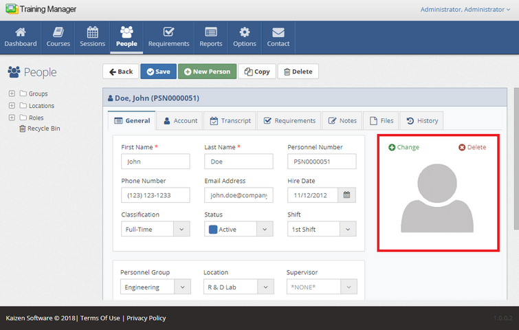
Picture fields allow you to add a picture to a record. This field is available on the Personnel Detail page.
| • | Click the Add Picture button to add a new picture to the record. |
| • | Click the Delete Picture button to delete the currently displayed picture. |
Tabs
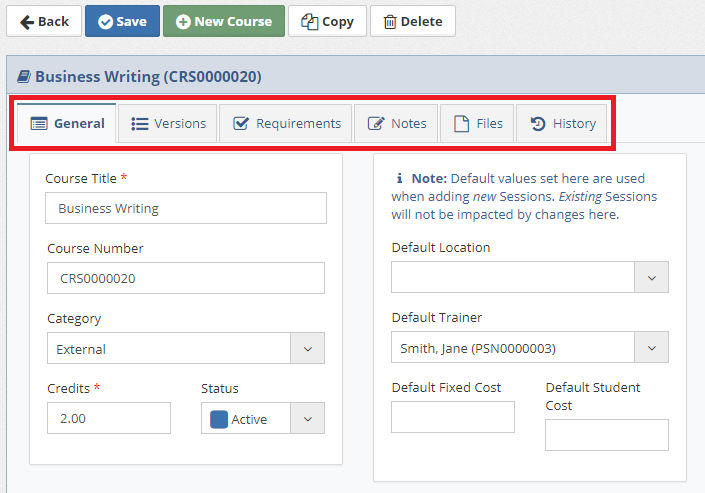
The Detail pages have tabs which contain groups of fields for data entry.
Notes Tabs
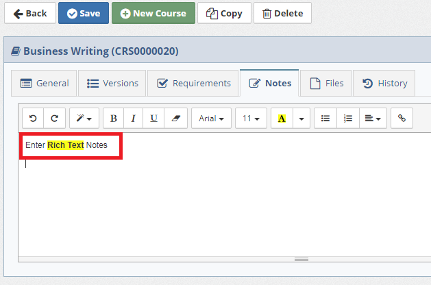
Enter rich text notes on the Notes tabs, including text formatting, numbered lists, and bullet lists.
Files Tabs
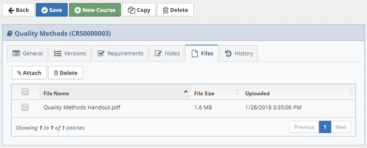
Upload any type of file on the Files tabs.
History Tabs
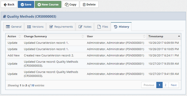
The History tabs on the detail pages show a timestamped list of updates to the record. Click on any row in the list for more details about the changes.
